
The longer I work with social media, the more I notice how much a profile's first impression matters. People often labor over the copy while overlooking the shape of the text and other visual details. The same message can feel quite different when its typography changes or when a few well-chosen emojis are added. BioFonts brings stylized text, emoji tools, and practical social media workflows together, making it easier to build a consistent look without a complicated design setup.
Use type to express the account's character
Stylized text is not only decorative. When readability is protected, type can communicate attitude and positioning, helping people who connect with that aesthetic understand the account more quickly.
A softer account might suit flowing, curved characters. A cool, minimal, or more forceful identity may work better with crisp Gothic forms or firmer letter shapes.
Three practical ways to use emoji
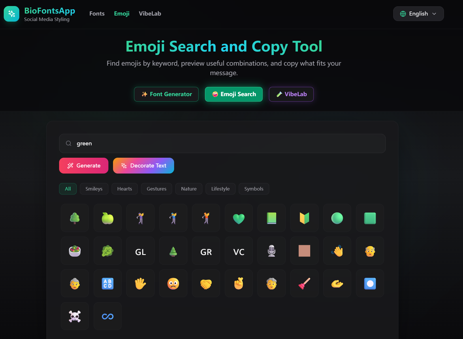
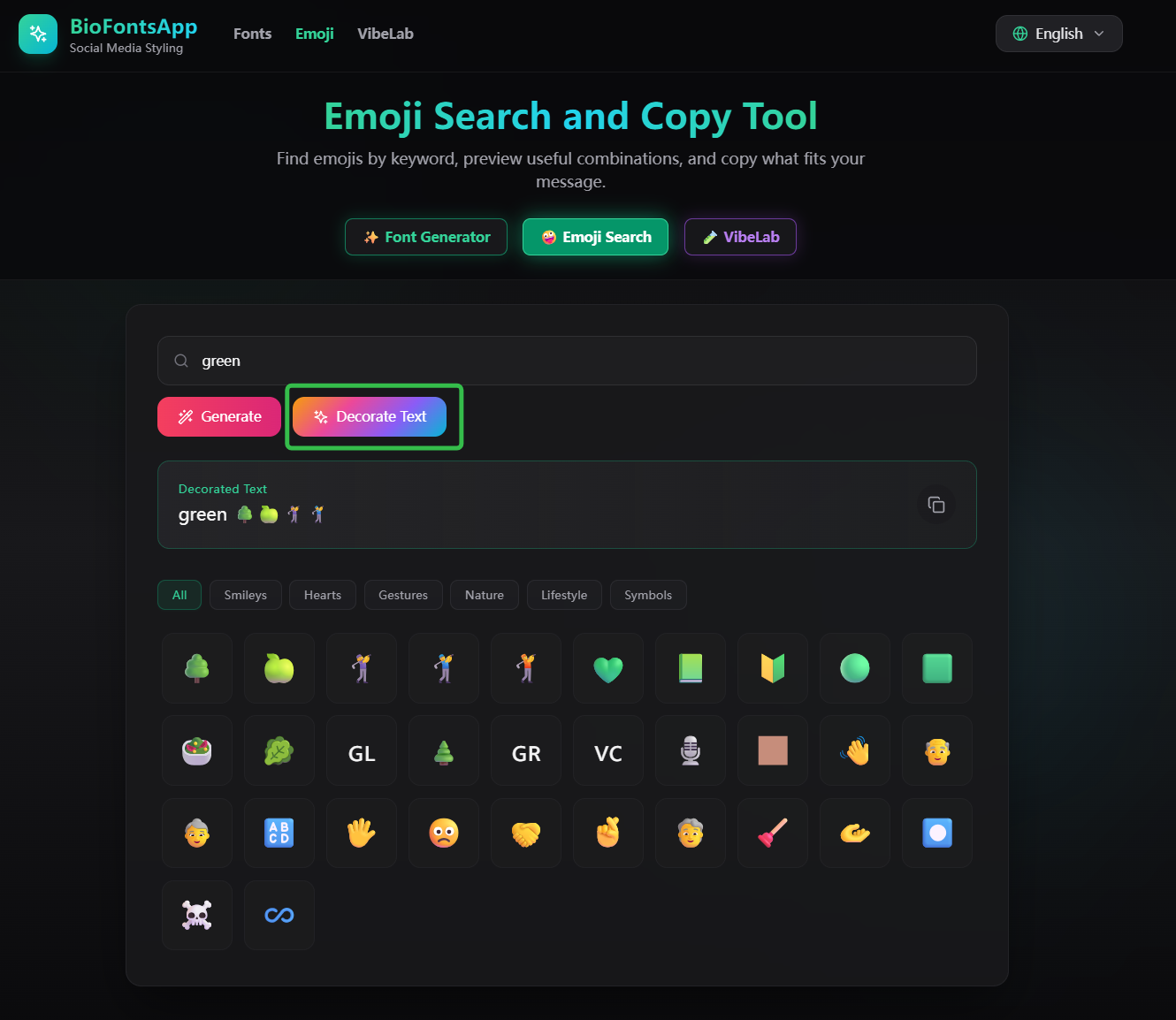
First, search by a simple idea such as “green” or “round” to find relevant emoji without scrolling through a phone keyboard.
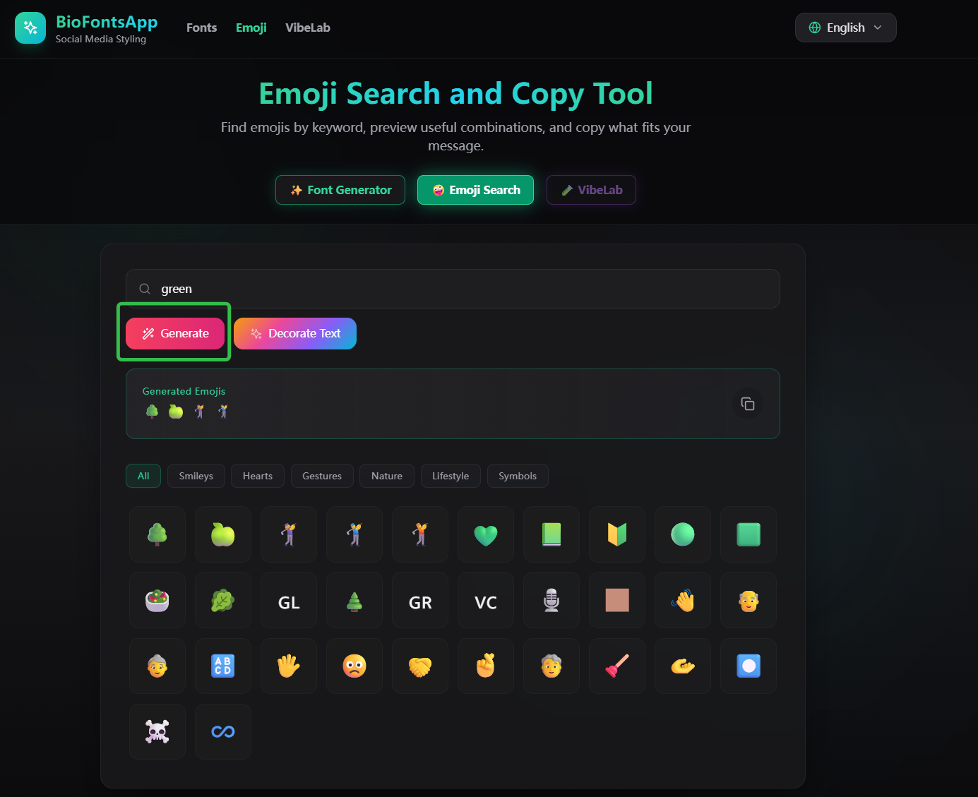
Second, paste a full sentence and let the tool suggest emoji-enhanced versions. Treat these as starting points and keep only what fits your tone.
Third, arrange the text and emoji yourself. Adjust their position and density to suit the rhythm of each platform. Used carefully, emoji can give a long passage breathing room and help readers spot its main points.
Working with multilingual audiences
The interface supports 12 languages: English, Spanish, Portuguese, German, Japanese, French, Simplified Chinese, Traditional Chinese, Russian, Korean, Arabic, and Indonesian. Characters and emoji may render differently across languages, devices, and platforms, so preview important text where you plan to publish it.
Good social presentation is not about adding decoration everywhere. Fonts and emoji should clarify a style, not compete with the message. BioFonts puts these small tasks in one place, so creators and shop owners can make a bio or caption feel more consistent without switching between several tools.
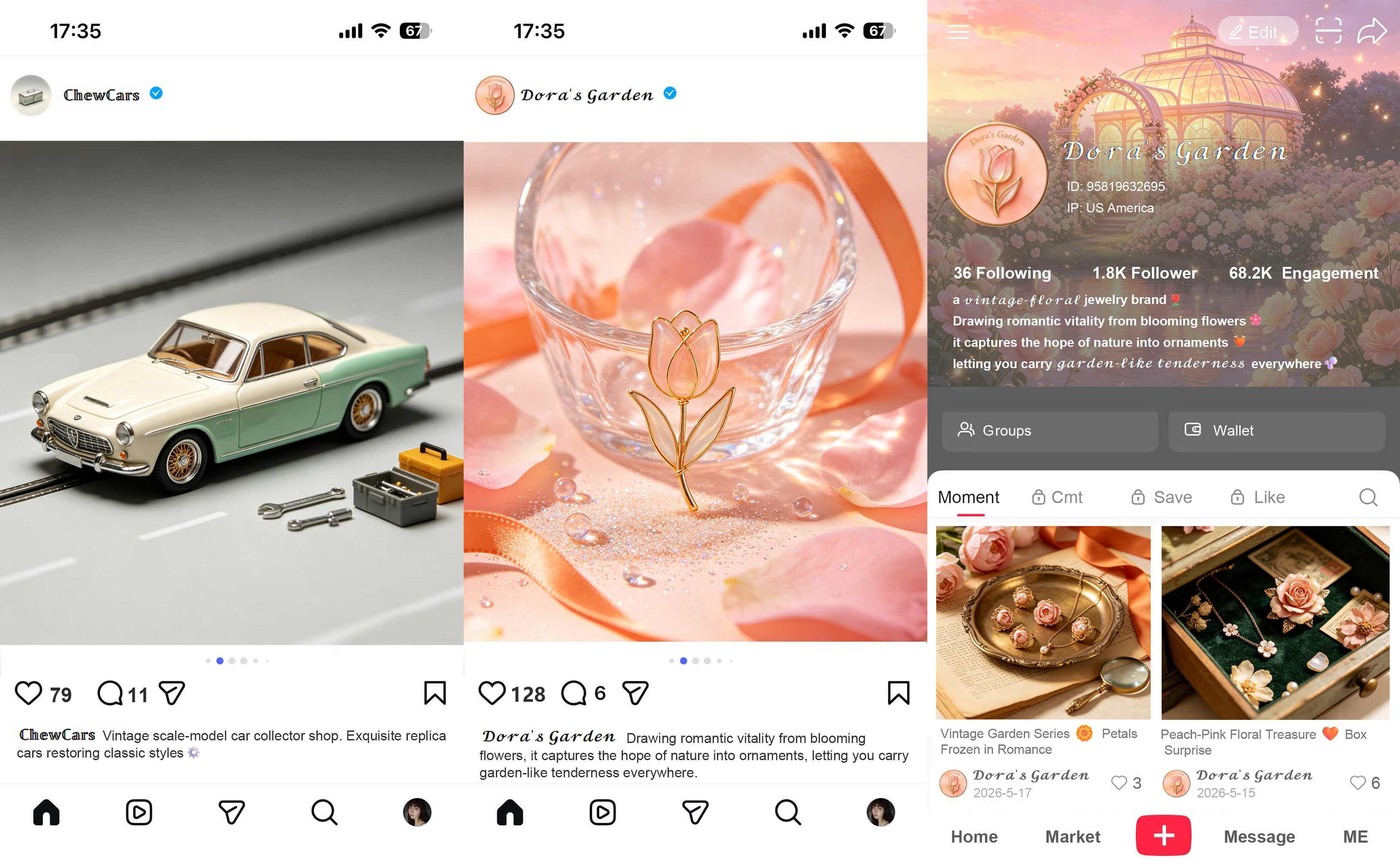
A real test from my Xiaohongshu accessories shop
I used this approach while promoting a hair clip called “Green Grape Milk Pearl.” Its main selling point was the rounded, fuller shape it gave the back of the head. I chose green emoji to echo the grape theme and rounded symbols to reinforce the product shape. I placed them around the selling-point lines rather than scattering them through every sentence.
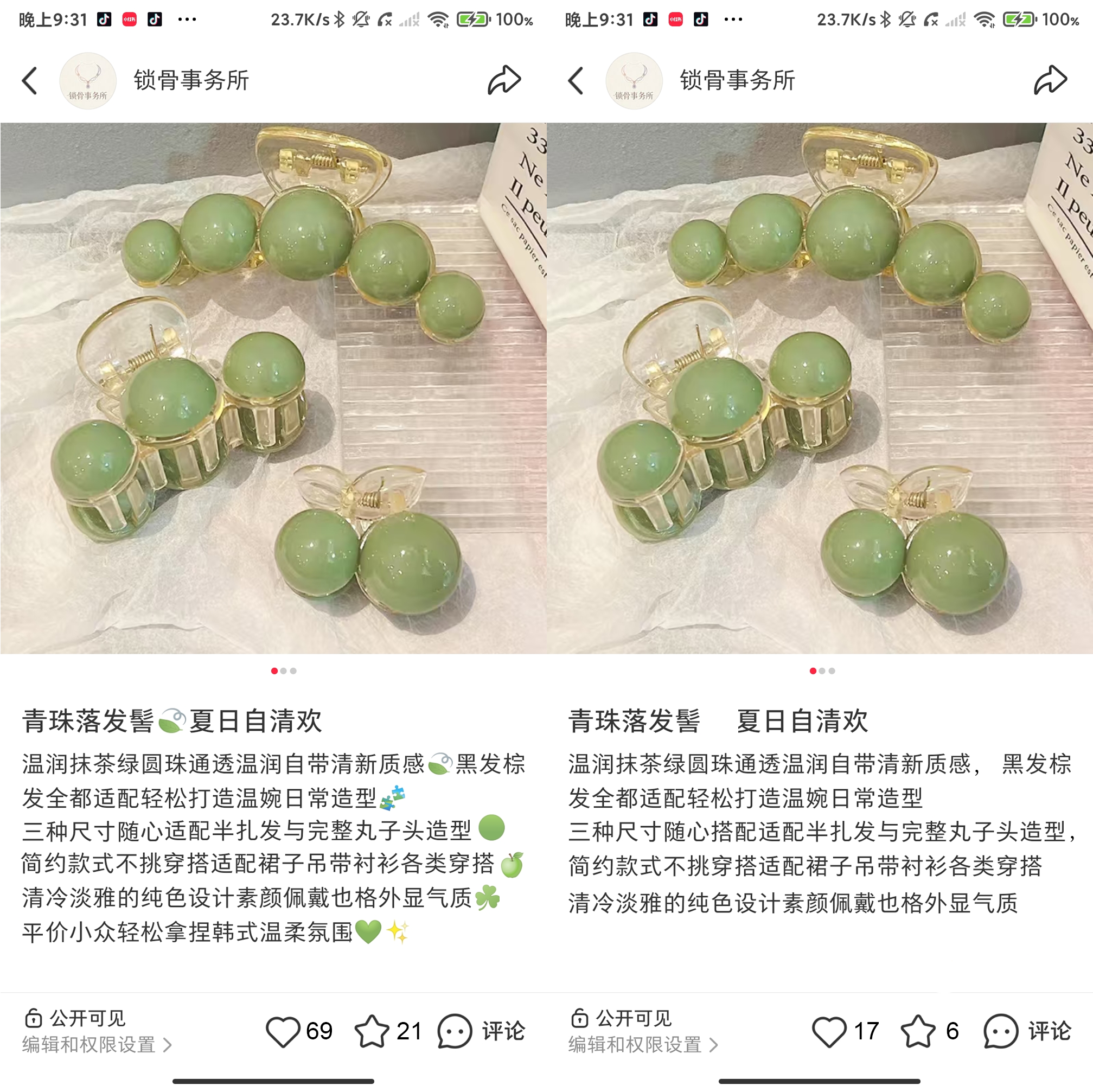
The green cues suggested grapes, while the rounded shapes reinforced fullness. Those details helped communicate the product image without repeating the same claim.
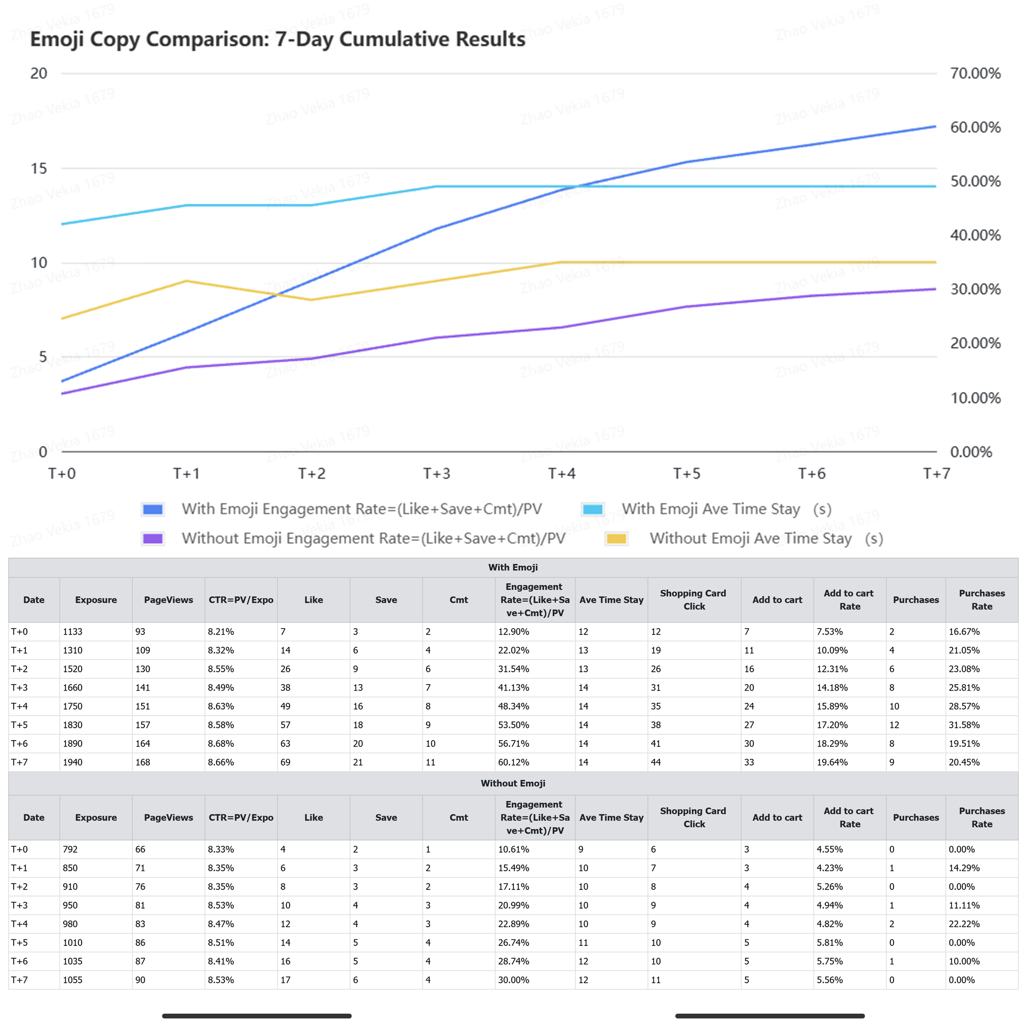
To see whether emoji might affect behavior, I ran a small comparison. The two posts were published seven days apart on weekday evenings. Their copy, title, hashtags, images, and product offer were kept the same; the main difference was that one version used emoji. Neither post received paid promotion. Because the platform did not randomly split the audience and the impression counts were unequal, this is an account-level observation, not a controlled causal experiment.
By day seven, click-through rates were close: 8.66% with emoji and 8.53% without. After people opened the post, engagement was 60.12% versus 30.00%, a difference of about 30 percentage points. Average time was 14 seconds versus 12 seconds, about 16.7% higher for the emoji version.
The emoji version also recorded 44 product-card clicks, 33 add-to-cart actions, and 9 purchases, compared with 11, 5, and 0. Total impressions were 1,940 and 1,055, and the sample was small, so the differences cannot simply be attributed to emoji. Still, for this product and account, emoji aligned with the color, shape, and selling point may have helped the reading rhythm, engagement, and product interest. It is worth testing again.