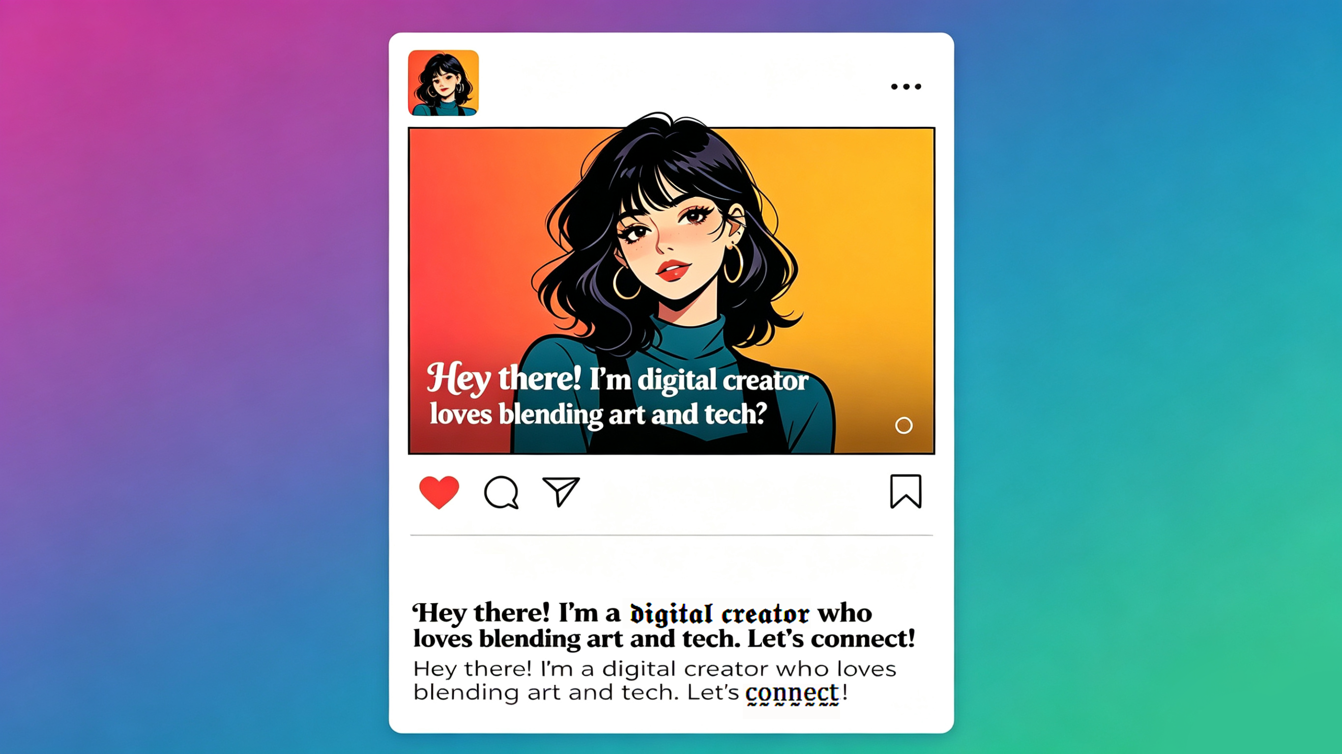

A bio has very little space to answer several questions: Who is this account for? What does it offer? Why should someone trust it? What should the visitor do next? Visual contrast can help organize those answers, but it should follow the information structure—not substitute for it.
Write the plain-text version first
Use three short lines as a starting point:
1. role or topic;
2. useful proof, location, or scope;
3. one next step.
For example:
- Product photographer for small food brands
- Studio and location work in Portland
- Portfolio and booking details below
This version already works without decoration. That is the baseline to protect.
Choose one point of contrast
The most useful phrase to emphasize is usually the role or the next step. Convert only that short phrase, then leave the explanation in standard text. A divider such as · or — may be enough; a decorative alphabet is not required.
Avoid styling the username, email address, URL, price, location, or an essential qualification. Visitors may need to search or copy those details, and assistive technology should be able to interpret them predictably.
Preview the real layout
Bio fields wrap differently by device, language, and platform. Paste the draft into the actual profile editor and check:
- whether the important phrase remains visible before truncation;
- whether line breaks separate ideas cleanly;
- whether any character appears as a box or unexpected symbol;
- whether the call to action still points to the correct link;
- whether the result remains understandable at a small text size.
Do not rely only on the generator preview. The platform's rendering is the one visitors see.
Compare two versions fairly
Keep the profile image, wording, link, and offer unchanged. Run the plain version and the lightly styled version for similar periods. Compare profile visits, link clicks, follows, and relevant inquiries. Note any external campaign or viral post that could distort the result.
A short test on a small account will not prove a general rule. It can still tell you whether the change caused obvious confusion or whether the difference is too small to justify reduced readability.
Common mistakes
Styling every line
This removes the contrast and makes the bio slower to scan.
Using decoration to hide a vague message
“Dreamer · Creator · Explorer” may look polished but tells a customer little. Clarify the offer before changing the typography.
Copying a competitor's format
A layout designed for a fashion creator may not suit a repair service, educator, or local shop. Preserve the information your audience needs.
Treating visibility as conversion
A phrase can be noticed without earning trust or prompting action. Measure the action that matters instead of assuming that novelty equals performance.
A final bio checklist
- The purpose of the account is clear in ordinary language.
- Only one short, nonessential phrase uses decorative characters.
- Contact details and links are plain and correct.
- The bio works when read aloud or copied into a notes app.
- The mobile preview has no awkward truncation.
- The change will be evaluated with a relevant metric.
Visual contrast is useful when it reduces the effort needed to understand a profile. If it competes with the message, standard text is the stronger design choice.
Try three bio drafts
Plain: Product photographer · Shanghai · Portfolio below.
Too much styling: 𝓟𝓻𝓸𝓭𝓾𝓬𝓽 𝓟𝓱𝓸𝓽𝓸𝓰𝓻𝓪𝓹𝓱𝓮𝓻 · 𝓢𝓱𝓪𝓷𝓰𝓱𝓪𝓲 · 𝓟𝓸𝓻𝓽𝓯𝓸𝓵𝓲𝓸.
One useful accent: 𝗣𝗿𝗼𝗱𝘂𝗰𝘁 𝗽𝗵𝗼𝘁𝗼𝗴𝗿𝗮𝗽𝗵𝗲𝗿 · Shanghai · Portfolio below.
Keep the photo, link, posting rhythm, offer, and wording unchanged. Run the plain and one-accent versions for seven comparable days; record profile visits, link clicks, follows, and inquiries. Restore the plain version when the result is unclear. Copyable starting points: Role · proof · next step; Topic · location · link; Who I help · outcome · contact. These are test drafts, not conversion promises.
Sources and scope
Unicode Mathematical Alphanumeric Symbols documents the underlying characters used by many bio font generators. WCAG 2.2 informs the readability and contrast safeguards. Any change in profile visits or link clicks must be measured on the account being tested.