Do special effect Unicode fonts really attract more attention? Readability and Compatibility Observations
Core Points: Special-effect Unicode fonts are suitable for a small number of emphasis on keywords, but may affect search matching, character display and screen reader experience, so body text, user names and important information should remain ordinary text.
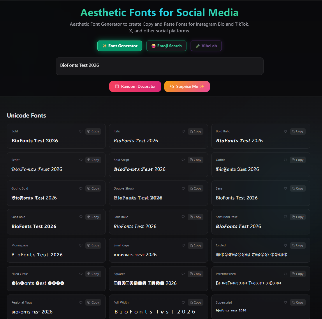
After selecting Bold, Script, Gothic or Double-Struck in BioFonts, the page does not change the font file for ordinary letters, but converts them into Unicode characters with similar appearance and different code points. For example, the regular Bold and the special effects form 𝐁𝐨𝐥𝐝 look close, but the computer saves two different sets of characters.
This difference explains why special-effect fonts stand out and why they may affect search, compatibility, and accessibility. This article does not presuppose which style is "certainly better", but summarizes compatibility considerations in actual use.
Why it might be easier to notice
The interfaces of platforms such as Instagram, TikTok, and X often use unified system fonts. When a small number of different glyphs appear in ordinary text, they create local visual contrast, making labels, column names, or short keywords easier to see.

But visual differences do not equal improved interaction. Images, topic selection, audience, publishing time, and the copy itself all affect the results. If the entire text is changed to cursive characters, contrast will disappear and the time required to identify each character may increase. Therefore, this article mainly discusses display, copy, search and reading methods, and does not directly write "more eye-catching" as "higher conversion".
Observation objects and examples
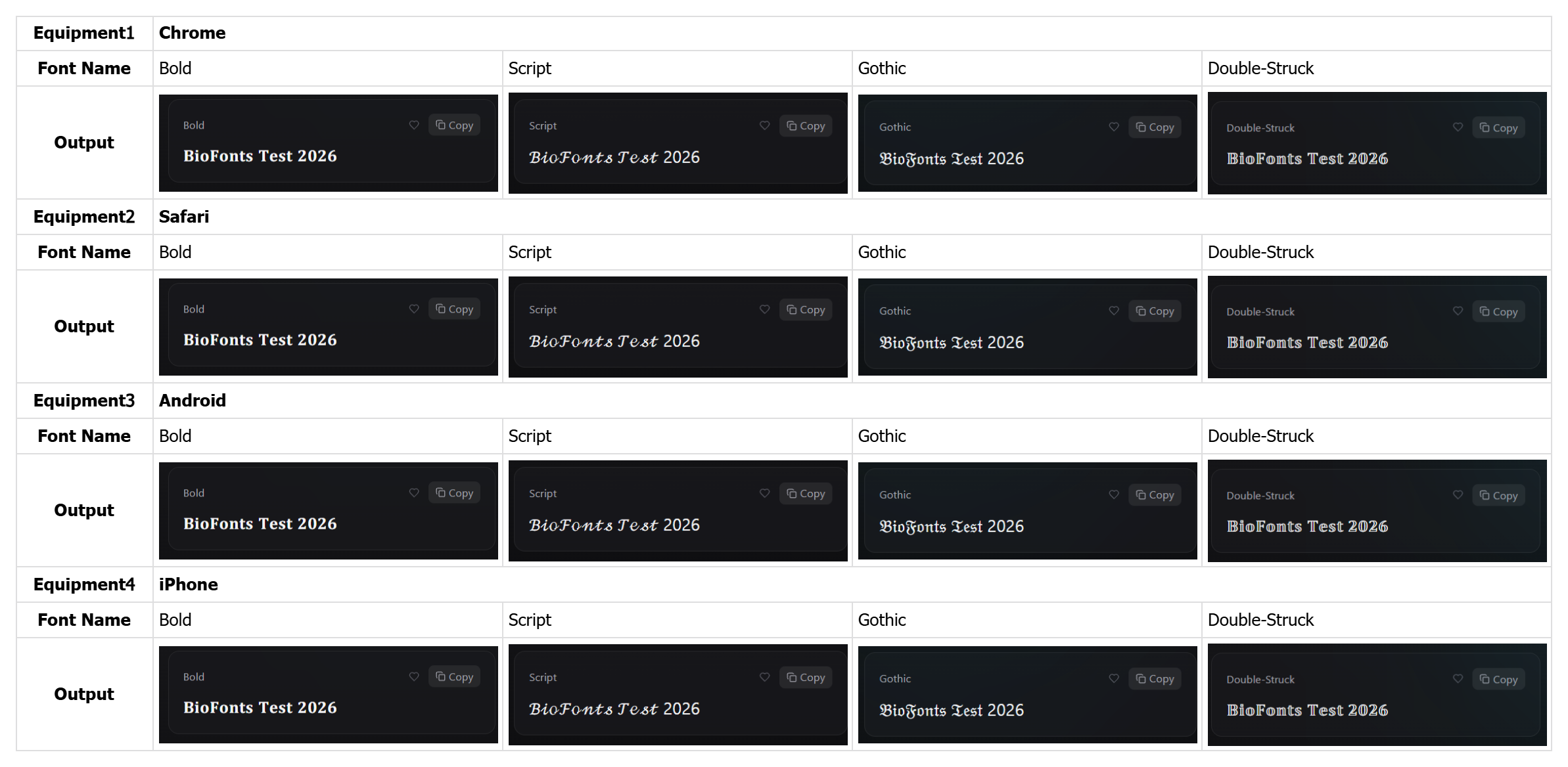
Choose four common styles:
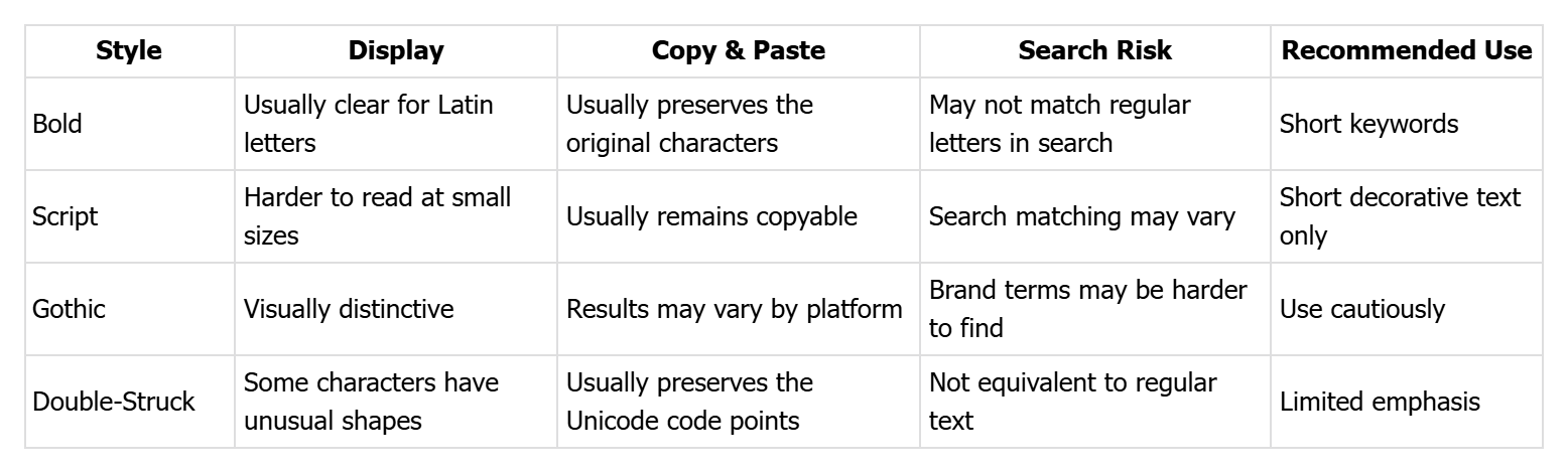
- Bold: The strokes are clear and suitable for a relatively stable emphasis effect.
- Script: The curve is obvious, suitable for observing the difficulty of identifying small fonts.
- Gothic: The fonts are quite different, suitable for observing the display effect and reading cost.
- Double-Struck: Special outline structure, suitable for observing search and screen reader performance.
This article uses the same English sentence as a comparison example: BioFonts Test 2026, while retaining ordinary text as a control.
Why it may not be found or displayed as a box
The ordinary letter B and the mathematical bold letter 𝐁 are different Unicode code points. Some platforms will normalize the search text, while others may match the original characters. Therefore, when users search for the ordinary "BioFonts", they may not be able to find a version written only with special effects characters.
Specific results must be verified on the target platform, and consistent behavior across all search systems cannot be assumed.
Display issues are often related to font fallback. The device needs to find the corresponding glyph from the available fonts; if the system or app does not have the appropriate glyph, it may display blank spaces, question marks, or boxes commonly known as "tofu blocks." Newer systems generally cover more characters, but compatibility is still device-specific, system version-specific, and in-app fonts.
Successful copying does not mean accessibility. Copying and pasting usually preserves the original Unicode code points, while screen readers may pronounce the characters individually by their formal mathematical symbol names. The results of different screen readers, languages and system versions may be different, and the actual reading still depends on the device used by the user.
Suitable for use
- A non-essential short tag such as New, Tips or Update.
- A decorative phrase in the introduction that does not have a search function.
- A small amount of visual emphasis in a poster or post while keeping normal text nearby.
- The content has been displayed, copied and screen-reading tested on the target device and platform.
Not suitable for use
- Long text, operating instructions, price, date and safety information.
- Core search terms in user names, account names, and brand names.
- URL, email, verification code, Hashtag and fields that need to be copied accurately.
- Information that only relies on special effects words to convey meaning without ordinary text replacement.
- Multi-language content that has not been tested on target platforms and assistive technologies.
Special note: What will be seen in different writing systems
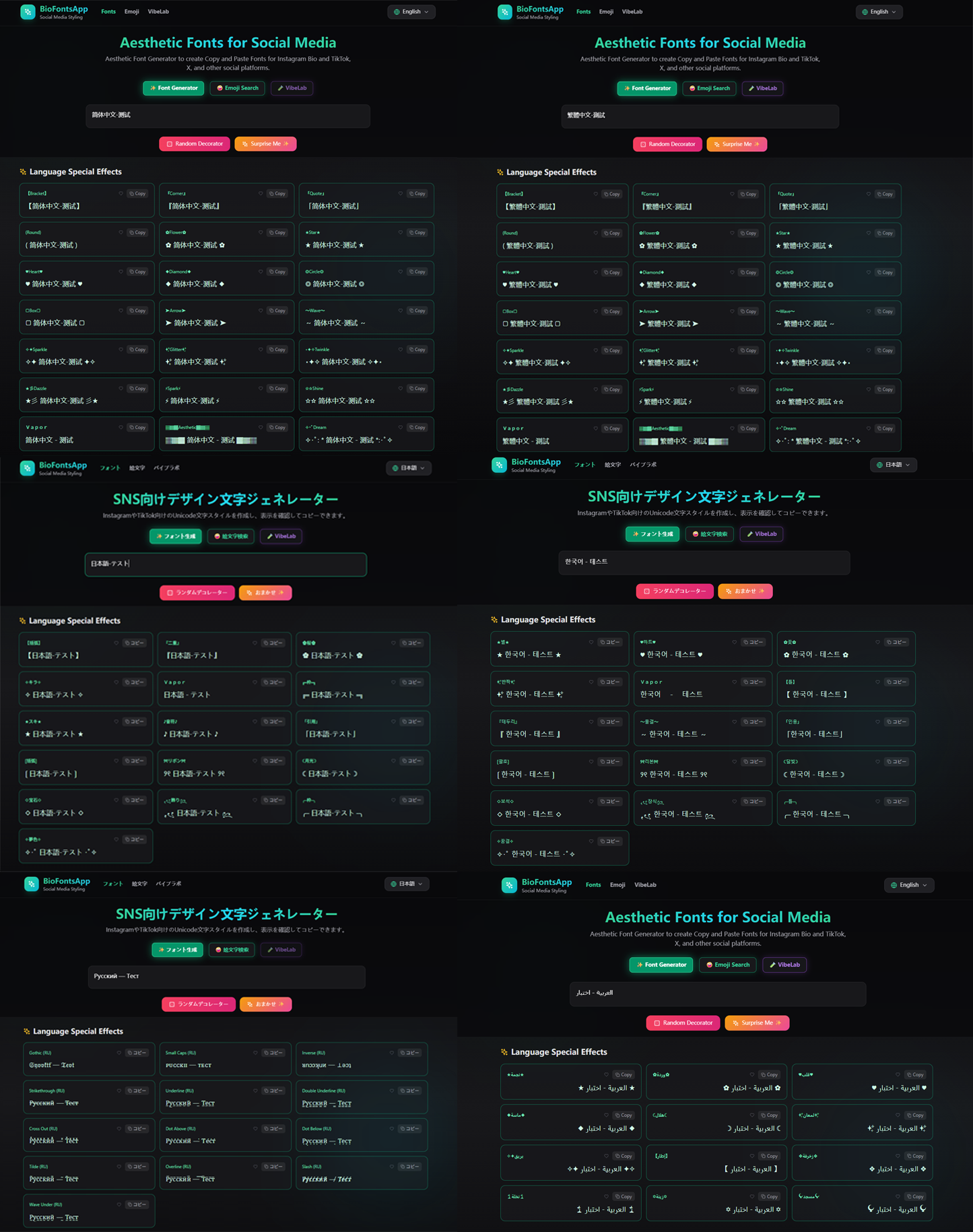
Because the original characters of Chinese, Japanese, Korean, Russian and Arabic are Unicode, but Unicode does not provide them with complete mathematical cursive characters like Latin letters, so special effects are mainly achieved by retaining the original characters and adding symbols, borders, etc.
Arabic text itself is also Unicode, but there is no complete corresponding mathematical cursive character, and the letters will be connected and deformed according to the position, so only borders, symbols and other decorative effects that do not destroy the ligatures and reading order can only be used first.
BioFonts will only display styles that actually change the input results based on the primary text system of the input content. Cards that produce no changes or duplicate results are automatically hidden, so the number of effects you see will vary by language.
English and other Latin alphabet text: Priority is given to displaying Unicode fonts such as Bold, Script, Gothic, Double-Struck, etc., while providing text effects such as underline, strikethrough, and spacing.
Simplified Chinese and Traditional Chinese: Give priority to displaying brackets, borders, symbols and decorative effects suitable for Chinese characters. The Chinese characters themselves will not be forcibly replaced with Latin cursive.
Japanese: After detecting hiragana or katakana, Japanese-specific effects such as brackets, cherry blossoms, musical notes, moonlight, and borders will be displayed first.
Korean: Prioritize the display of stars, hearts, flowers, borders and other decorative effects suitable for Korean, while retaining the original Korean glyphs.
Russian and other Cyrillic text: Prioritize the display of Gothic, Small Caps, Underline and other language effects available in Cyrillic letters. Invalid fonts that only support Latin letters will not be displayed.
Arabic: Use right-to-left layout and only display decoration and border effects that do not disrupt the connection between Arabic letters.
If a piece of text contains multiple text systems at the same time, such as Chinese and English, BioFonts will retain the original Chinese and apply Unicode fonts to the convertible English parts. The final page only shows options that actually make a difference and don't have duplicate results.
Clear conclusion
Special effect fonts can highlight a few keywords, but are not suitable for core search terms in body text, usernames, or important accessibility information.
The reason is not that it will not be displayed, but that these characters have different code points than ordinary letters: search matches may be inconsistent, boxes may be displayed when corresponding glyphs are missing, and screen reader pronunciation may be longer or difficult to understand.
A safer approach is to first write the message clearly in normal text, then add styles to an unnecessary phrase, and test it in a real release environment. If compatibility, search, or screen reading results are not ideal, keep the plain text.
Based on the existing page display and copy experience, these four styles can usually be displayed and copied on modern devices, but this does not mean that all platforms, systems, and assistive technologies will perform exactly the same. Because special effect characters use different Unicode code points than regular letters, they can affect search matching, character fallback, and screen reader speech. Therefore, it is recommended to only use non-essential short word decorations, and continue to use ordinary text for brand name, user name, body text and important information.
Data and Observation Boundaries
Unicode Mathematical Alphanumeric Symbols lists mathematical alphanumeric symbols such as Bold, Script, Fraktur/Gothic and Double-Struck and their independent code points.
WCAG 2.2 provides an accessibility baseline for perceptibility, text scaling, text spacing, and assistive technology compatibility. WCAG does not simply ban special effects Unicode characters, but important information should still remain clear, understandable, and accessible to different users and devices.
This article summarizes the usage boundaries based on existing page display, copy experience and Unicode/WCAG data. It does not mean that the performance of all devices and platforms is exactly the same.