
Typography shapes the pace, hierarchy, and consistency of a brand experience. It can make product information easier to navigate and help different pages feel related. It cannot compensate for a weak product, unclear positioning, poor service, or inconsistent photography.
The examples below are observations of public brand systems, not proof that a particular font creates pricing power.
Three different visual systems
Aesop: editorial hierarchy
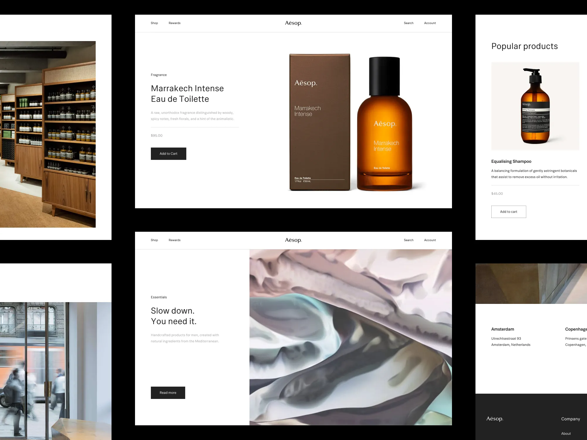
Aesop often combines serif-led editorial cues with restrained interface text and generous spacing. The useful lesson is not “serif equals luxury.” It is that headings, explanations, labels, and controls have clearly different roles while still belonging to one system.
Glossier: approachable minimalism
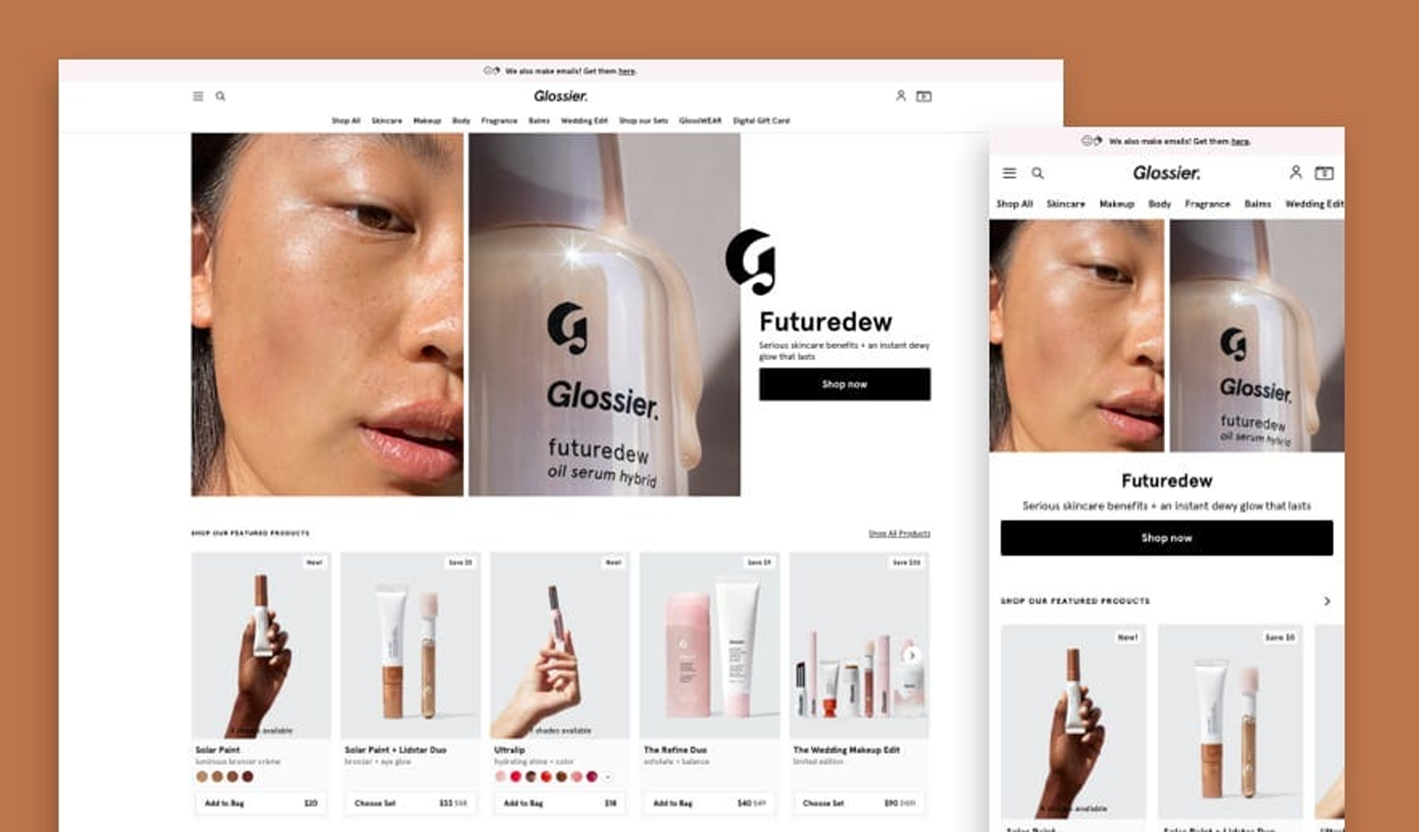
Glossier uses a lighter, contemporary visual language with ample room around products and short blocks of copy. Its tone, photography, color, and typography work together. Copying only the typeface would not reproduce the brand.
Le Labo: industrial consistency
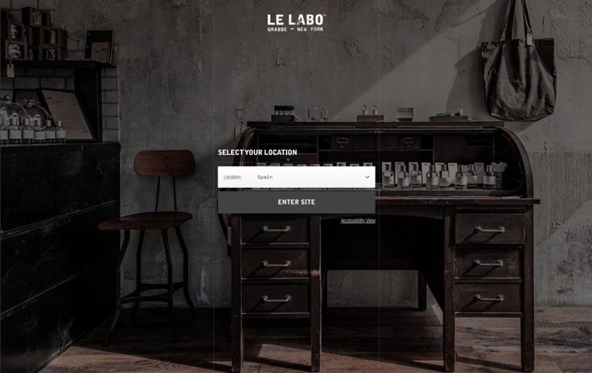
Le Labo's typewriter and laboratory references support a product story built around formulation and craft. The typography is effective because it is repeated across labels, packaging, stores, and digital touchpoints—not because monospace type is inherently premium.
Build roles before choosing fonts
Define a small set of text roles: display heading, section heading, body, label, price, caption, and button. For each role, record size, weight, line height, letter spacing, and color. This makes hierarchy testable and prevents every new page from inventing its own style.
One type family with several weights can be enough. A second family is useful only when it creates a clear, repeatable distinction. More families increase loading, licensing, and consistency work.
Treat spacing as part of the type system
There is no universal percentage of empty space that makes a design premium. Start with a spacing scale and use it consistently between related elements. Increase space when groups are hard to distinguish; reduce it when connected information feels fragmented.
Test real product names, long localized headings, prices, error messages, and sale labels. A layout that looks calm with placeholder copy can break when actual content arrives.
Use color without weakening readability
Warm neutrals and softer contrast can support a particular mood, but body text still needs sufficient contrast. Check text and interactive controls against accessibility criteria. Do not make essential information faint merely to imitate a muted editorial look.
A practical typography audit
Review five representative pages and record:
1. How many type families and weights are loaded?
2. Does each heading level look and behave consistently?
3. Can body text be read comfortably on a small screen?
4. Are price, availability, and actions easy to locate?
5. Do buttons look interactive without overpowering the product?
6. Does localization cause clipping or awkward wrapping?
7. Are image text and decorative Unicode repeated as accessible HTML nearby?
Fix the inconsistencies that appear across several pages before adjusting small decorative details.
Test the whole experience
When evaluating a typography change, compare task completion rather than asking only which screenshot “looks premium.” Can customers find a product detail, understand shipping, compare options, and complete a purchase without hesitation? Qualitative interviews can reveal confusion; analytics can show where people stop.
The limit of the design claim
Typography contributes to perceived coherence and tone, but premium positioning is a combined result of product quality, pricing, service, reputation, photography, copy, and interaction design. A restrained type system is valuable because it reduces noise and supports those elements—not because it guarantees a higher price or conversion rate.
Source notes and a before–after exercise
The three visuals above are BioFontsApp editorial comparison graphics informed by public brand websites; they are not official brand assets or endorsements. Public references reviewed on 25 August 2026: Aesop, Glossier, and Le Labo.
A web font changes glyph rendering through a font file and CSS; stylized Unicode text replaces ordinary letters with different characters. Use web fonts for a site's consistent type system and reserve Unicode decoration for short, tested social text. For a real product-page exercise, keep product, copy, price, and images fixed; reduce competing type styles, clarify heading/body/price roles, adjust line height and spacing, then compare mobile task completion. Check font count, hierarchy, line height, spacing, contrast, wrapping, and controls. Typography supports the experience; it does not create pricing power by itself.
Sources and scope
WCAG 2.2 is the reference for the contrast, text resizing, and spacing cautions in this guide. Brand examples are editorial observations of public visual systems; they do not establish a universal formula or prove that typography alone changes pricing power.